The year was 2010. Both iPhone and Android were gaining popularity, with the prospects of a duopoly emerging between Google and Apple. Microsoft had mostly abandoned its efforts to bring Windows to phones with its old Windows Mobile. It never had mass-market appeal because Windows Mobile was difficult to use and lacked the excitement of iPhone and Android.
However, Microsoft had a final act in mobile. This was one the company had been working on for years, and that happened to be ahead of its time. But was simply too late and didn’t have enough apps. Windows Phone brought us fresh hardware, but more importantly, a truly mobile-first user interface that was fast, fluid, and beautiful.
Metro UI
The look that tied it all together
Microsoft logo
Before calling it quits on phones as it was moving past Windows Mobile, Microsoft had one more trick up its sleeve: Windows Phone.
Taking elements from the acclaimed fluid and text-based Metro UI found in Windows Media Center and Zune, Windows Phone was truly different and exciting. It featured a typography-based user interface with flowing animations, bold color accents, and a level of performance that always felt fast, no matter the hardware.
The live tile interface
It was revolutionary
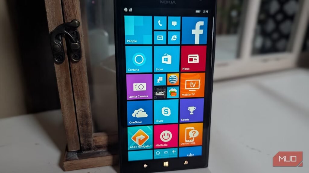
The live tile interface was the core heart of Windows Phone, and it was stunningly beautiful. Instead of rows and rows of icons, like iPhone OS and Android at the time, Windows Phone presented you with a vertically scrolling home screen interface. This displayed subtly animated tiles, providing information without requiring a tap into the app.
You could choose different live tile sizes for each app. Smaller tiles would display bits of information; if you wanted to see more live information, you could pick a bigger live tile. (Did you know you can bring the Windows Phone look to Android?)
Windows Phone was glance-and-go, compared to Android and iPhone, which were hunt-and-peck. For example, instead of opening your email app, looking at the email live tile would show your unread message count. And if you had chosen a larger live tile, you could see a preview of your most recent message.
Related
Please stop using Outlook
Outlook feels too much like Microsoft and that’s the problem
Likewise, the AccuWeather tile could be just a link to the app. But if you expanded it into a larger tile, you could see the current weather conditions right on your home screen without opening the app.
This paradigm applied to many third-party apps: the small live tile would give you a basic icon and an unread counter, then as you expanded the live tile, you got more and more information. And you could prioritize your live tiles based on the info you needed most—the top of your screen could be devoted to the largest and most important live tiles, while lower down you could have numerous app shortcuts and folders.
You could glance at your Windows Phone live tiles momentarily, get a ton of information, and then move on without opening any apps. It was like a life dashboard. In a world where everyone gets sucked into their phones too often, that’s a refreshing change.
Content hubs, an amazing keyboard, and system fluidity
Fast and delightful animations made Windows Phone feel incredibly fluid
From the fast keyboard to the satisfying animation that slid away the lock screen cover, Windows Phone felt fast and fluid. It had a colorful typography-based UI that stood out as different, plus it was smooth.
In Windows Phone, Microsoft introduced the concept of Hubs, which were centralized places that aggregated content based on specific themes. For example:
- People Hub: This combined phone contacts with friends from Facebook, Twitter, and other social networks. Within this hub, you could see what your friends were “up to” in one place without having to check multiple social networks. It even pulled in texts and emails you had with a contact, all in one place.
- Pictures Hub: Integrated photos from your local storage with online albums from Facebook, OneDrive, Flickr, and other sources.
- Office Hub: Hosted mobile versions of Microsoft Office apps like Word and Excel. Offered quick access to all Office files, whether stored on your phone or on cloud-based services like OneDrive or SharePoint.
Why Windows Phone failed
Apps, apps, and apps
After ending active development of Windows Phone in 2017, Microsoft officially killed Windows Phone in 2020, five years after Windows 10 Mobile came out. It was a sad outcome; Windows Phone was truly different, but it was too ahead of its time.
What really killed the platform was the lack of apps. Developers didn’t have the bandwidth to publish apps for three platforms, with iPhone and Android taking priority since they had a combined 97% market share to Windows Phone’s 3%. Of course, developers weren’t going to spend time writing apps for a platform that only 3 out of 100 people had.
Related
I tried living with a Windows Phone in 2025 and it worked better than I expected
Oh, how I’ve missed this long-lost phone OS.
Some high-flying key apps were never made for Windows Phone, like all of Google’s apps (no Gmail, no YouTube, no Google Maps), and popular social media apps like Snapchat, Vine, and Tinder. Many banking tools didn’t have a Windows Phone app, and even key services like Uber and Airbnb, while available for years on Android and iPhone, never made it to Windows Phone.
It’s a harsh lesson: no matter how smooth or beautiful a software interface is, if it fails to deliver what people actually need—in Windows Phone’s case, a robust app ecosystem—it’s doomed. Which is a shame, because Windows Phone had a lot going for it.

