

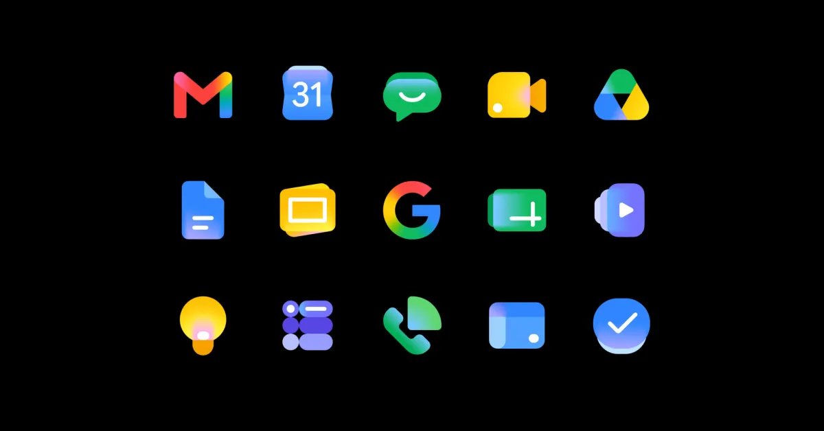
While the new Google Workspace icons appeared throughout I/O 2026, Google did not discuss them during the keynote. The company has since provided more details about the redesign.
After the keynote last Tuesday, @GoogleWorkspace posted about how it “gave the Google Workspace icons a sleeker look to meet this new era of helpfulness.” Google thinks of these “new logos for the Gemini Era” as “bold.”
At this point, all Workspace apps have Gemini-powered AI features, with I/O debuting Gmail Live, Docs Live, and a new voice feature for Google Keep.
Today, Google officially introduced the “fresh visual identity for Google Workspace app icons.” As made obvious by the new icon shapes, this “modern” visual design “gives every app a more distinct identity.”
- “These changes drive consistency and cohesion across our product suite, while ensuring each individual application remains modern and recognizable on your screen.”
For example, Docs, Sheets, Slides, Keep, Forms, Sites, and Vids no longer use a piece of paper as their background container. Similarly, Calendar, Meet, and Chat are no longer extremely boxy. The mandate for logos to use all four Google colors is gone, with Gmail being the only exception.
Google emphasizes that these “design updates do not alter any core functionality or administrative controls.”
These updates are coming to Gmail, Calendar, Chat, Meet, Drive, Docs, Slides, Sheets, Vids, Keep, Forms, Voice, Sites, and Tasks “over the next several weeks.”
FTC: We use income earning auto affiliate links. More.
