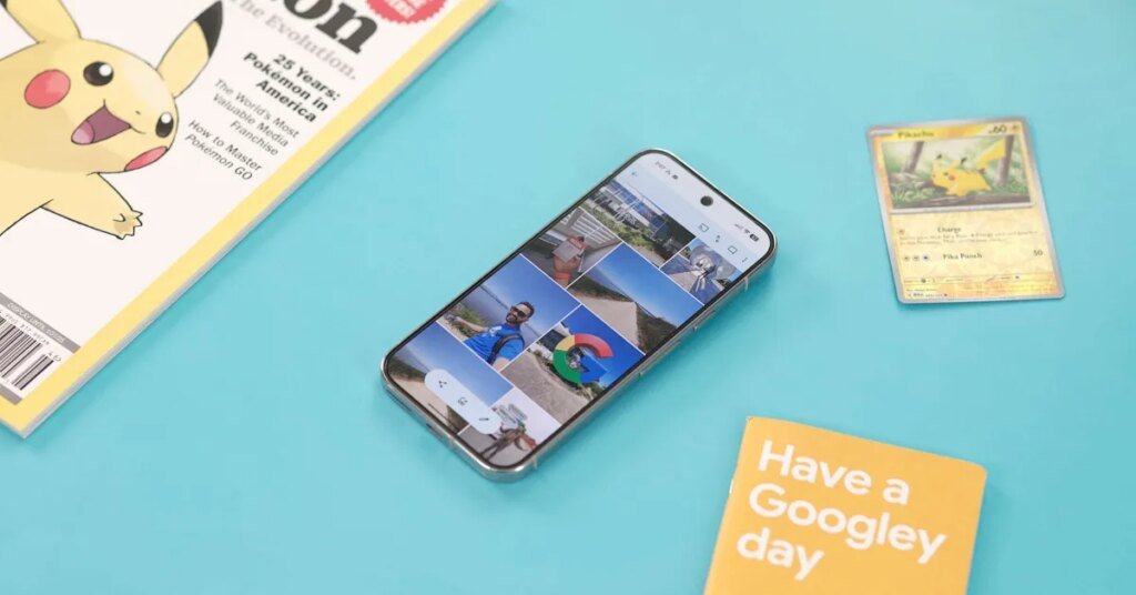
The vast majority of Google’s Android apps have switched to a short bottom bar. Google Photos was the big exception, but we now know it’s moving to a floating toolbar, starting on iOS.
This floating toolbar for Photos, Collections, and Create is housed in a pill-shaped container. When you’re viewing a particular tab as noted by another pill indicator, you’ll also see an accompanying icon at the left. A FAB (floating action button) at the right lets you Search or Ask.
The toolbar is persistent and does not auto-hide upon scrolling. It is indeed a lighter component than the bottom bar being replaced. It’s placed high enough on the screen so that you can meaningfully see the images (content) below it.
That being said, this floating toolbar — as currently listed in the Material 3 Expressive guidelines — is not meant to be a navigation component that replaces the bottom bar.
Rather, it’s meant to house “frequently used actions relevant to the current page.” One Google example shows a floating toolbar on an email page with actions like archive and delete. A correct implementation can be found in Google Photos Albums.
Google has been using it for navigation since its introduction in Google Chat two years ago.
We’re seeing the Google Photos floating toolbar just on iOS (version 7.63) today. Hopefully, we’re also getting updated design guidelines.
FTC: We use income earning auto affiliate links. More.

